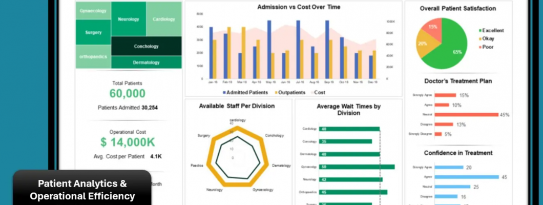
In today’s data-driven landscape, organizations have access to more information than ever before yet data by itself rarely leads to better decisions. The true value lies in how that information is interpreted and communicated. This is where dashboard storytelling makes a powerful difference. Rather than overwhelming users with endless charts and metrics, storytelling dashboards present data in a clear, structured narrative that helps viewers quickly understand what matters most.
An effective dashboard goes beyond reporting numbers. It provides context, highlights key trends, and connects insights to business goals. Instead of simply showing what happened, it explains why it happened and clearly points to what actions should be taken next. By guiding users through insights step by step, dashboards become decision-support tools rather than static reports.
Through the thoughtful use of visual hierarchy, contextual comparisons, and focused messaging, dashboard storytelling turns complex datasets into meaningful insights. The result is greater clarity, increased confidence in decision-making, and faster, more informed actions. When data is presented as a story, it becomes easier to understand, easier to trust, and far more likely to drive real, measurable results.
What Is Dashboard Storytelling?
Dashboard storytelling is the practice of structuring data visualizations in a way that communicates insights clearly and logically. It connects data points into a narrative that aligns with business goals and user needs.
Rather than displaying every available metric, storytelling dashboards focus on:
Key performance indicators (KPIs)
Trends and patterns
Comparisons and benchmarks
Causes and effects
Actionable recommendations
The goal is simple: help users understand insights quickly and make informed decisions without confusion.
Why Dashboard Storytelling Matters
Many dashboards fail because they prioritize data quantity over clarity. When users are overwhelmed, insights get lost and action is delayed.
1. Faster Decision-Making
Story-driven dashboards reduce cognitive load, enabling users to grasp insights at a glance.
2. Clear Focus on What Matters
Narrative structure highlights critical metrics instead of distracting viewers with unnecessary data.
3. Better Stakeholder Alignment
When everyone sees the same story, teams align around shared goals and priorities.
4. Increased Engagement
Well-designed dashboards encourage exploration and repeated use.
Core Elements of Effective Dashboard Storytelling
To present data that inspires action, dashboards should combine several key elements:
1. A Clear Purpose
Every dashboard should answer a specific question, such as:
Are we meeting our targets?
Where are we losing revenue?
Which campaigns are performing best?
What needs immediate attention?
Defining the purpose prevents clutter and keeps the narrative focused.
2. The Right Audience Context
Executives, managers, and analysts all need different views. Effective dashboards tailor:
Metrics
Level of detail
Visual complexity
Language and terminology
Understanding the audience ensures insights are relevant and actionable.
3. Strong Visual Hierarchy
Visual hierarchy guides the viewer’s eye through the story. Use:
Large, bold numbers for key KPIs
Strategic color to highlight changes or risks
Logical grouping of related metrics
Consistent chart types and scales
This helps users instantly identify what matters most.
4. Data Context and Comparisons
Data is more powerful when placed in context. Dashboards should show:
Period-over-period changes
Targets vs. actuals
Benchmarks and averages
Historical trends
Context answers the critical question: Is this good or bad?
5. Simplicity and Clarity
Great dashboards embrace simplicity. Avoid:
Too many charts on one screen
Complex visuals that confuse users
Excessive colors or animations
Unclear labels or jargon
Clear dashboards lead to confident decisions.
Design Principles for Action-Oriented Dashboards
Storytelling dashboards don’t just inform — they guide action. Here’s how to design with intent:
1. Start With the Insight, Not the Chart
Instead of asking “Which chart should I use?”, ask:
What insight do I want users to notice?
What action should they take?
Choose visuals that best support that message.
2. Use Headlines That Tell the Story
Replace generic titles with insight-driven headlines, such as:
❌ “Monthly Sales.”
✅ “Sales Increased 18% After Campaign Launch.”
Headlines frame the narrative and focus attention.
3. Highlight What Needs Action
Use visual cues to guide decisions:
Red for risks or declines
Green for positive performance
Icons or alerts for urgent issues
This makes dashboards actionable, not passive.
4. Provide Drill-Down Options
Allow users to explore deeper without cluttering the main view. Interactive dashboards let users:
Click to see details
Filter by region, product, or channel
Compare segments easily
Interactivity supports exploration while preserving clarity.
Common Dashboard Storytelling Mistakes
Avoid these pitfalls to keep your dashboards effective:
Showing every metric “just in case.”
Using inconsistent scales or colors
Ignoring data quality and accuracy
Overloading dashboards with technical details
Designing for aesthetics over usability
A beautiful dashboard is useless if it doesn’t drive action.
Real-World Examples of Dashboard Storytelling
Marketing Dashboards
Tell the story of campaign performance, audience engagement, and ROI — guiding budget decisions.
Sales Dashboards
Highlight pipeline health, conversion rates, and revenue gaps — helping teams prioritize deals.
Operations Dashboards
Reveal bottlenecks, efficiency trends, and resource usage — supporting process improvements.
Executive Dashboards
Summarize strategic KPIs with high-level insights for fast decision-making.
How AI Enhances Dashboard Storytelling
Modern dashboards increasingly use AI to strengthen storytelling by:
Detecting patterns automatically
Generating insight summaries
Forecasting future performance
Recommending actions
Identifying anomalies
AI-powered insights help users focus on what truly matters without manual analysis.
Measuring Dashboard Effectiveness
A successful storytelling dashboard should:
Reduce time to insight
Increase decision confidence
Improve engagement and usage
Drive measurable business outcomes
Collect feedback and refine dashboards continuously based on user behavior and needs.
The Future of Dashboard Storytelling
As data grows more complex, storytelling will become even more critical. Future dashboards will be:
More personalized
More predictive
More interactive
More focused on outcomes, not just metrics
The shift is clear: dashboards are evolving from reporting tools into decision-making engines.
Final Thoughts
Dashboard storytelling bridges the gap between data and action. By presenting insights with purpose, clarity, and context, organizations empower users to make better decisions faster.
In a world overflowing with data, the dashboards that inspire action are the ones that tell the clearest stories.

Leave a Comment